Muse
An eCommerce Clothing Website
Muse is a hypothetical clothing store brand based in Vancouver, targeting the modern socially conscious consumer who is looking for good quality, classic, and long-lasting clothing for any occasion. Their goal is to create ethical and sustainable clothing that is accessible to everyone.
They currently only have a physical storefront, with no eCommerce website available to customers.
Role
UX Designer
Softwares
Figma
Adobe CC
Date
May - Jul 2021
Timeframe
8 Weeks, 60 Hours
Muse’s current branding is outdated, and sales are dropping as more customers are preferring to shop online. The goal was clear:
How can I design a new brand identity and responsive eCommerce website for Muse, to increase online sales from both existing and new customers?
I began by creating a research plan that outlined the problem space, research goal, research questions, methodologies, participant screening requirements, and assumptions. As part of my methodologies, I started with secondary research (public data), then moved onto primary research (first-hand research).
My 4 distinct research goals will guide me throughout this process:
Understanding habits and behaviours of online shoppers
Learning frustrations and pain points of online shoppers
Identifying what brings online shoppers value and delight
Discovering how online shoppers develop brand trust & loyalty
View my full research plan.
Research Methodologies
Market Research
The first step was to explore existing information about eCommerce web design. I looked at blogs, articles, and statistics to have a baseline understanding of eCommerce trends and best practices.
Due to the wealth of information on eCommerce shoppers that already existed online, I was able to create provisional personas, simplified personas based on assumptions and existing data. This was helpful starting point to guide me through my research process.
Millennials and Gen Xers are the biggest online shoppers.
67% of millennials and 56% of Gen Xers prefer to shop online versus in a brick-and-mortar store.
81% of consumers conduct online research before making a purchase online.
Online shoppers need detailed and accurate information on the products they want to purchase.
Free delivery is the #1 reason people shop online.
Other reasons include the ability to use coupons, read reviews, easily return their items, and have a quick checkout process.
Provisional Personas
Competitor Analysis
To gain a better understanding of the current eCommerce landscape, I analyzed several successful competitor websites. This provided valuable insight into common design patterns and features, and helped to create a user experience that exceeds user expectations in a highly competitive market.
View my full competitor analysis.
User Interviews + Observation
I interviewed 4 participants to discover deeper insights into their behaviour, values, frustrations, and how they develop trust when online shopping.
In addition to the interviews, I also observed participants as they purchased an item from an online store of their choice. Utilizing the “think aloud” methodology, this revealed more specific aspects of an existing interface that either delighted, confused, or frustrated the participant.
Key Insights
Online shoppers highly trust recommendations and reviews from others.
This may include friends mentioning sales or brands, chatting with people on forums, reading reviews, or seeing influencers on social media.
Online shoppers tend to shop at the same shops consistently, due to trust.
This includes factors like familiarity in customer service, sizing, and quality. Once a customer has a positive experience with a brand, they are likely to repurchase.
Products must have robust and accurate information, especially on sizing.
This is particularly important for online shoppers who are not considered “average” height or size.
Online shoppers like to feel like they are getting a good deal or discount.
Knowing exactly how much they are saving is important, and if the sale is only going on for a limited time, it gives a sense of urgency to purchase.
Shipping and return information need to be clear, concise, and easy to find.
Online shoppers want to be aware of shipping and return costs as soon as possible.
Ethical and sustainable production make online shoppers feel better about their purchase.
Being transparent with this information builds trust between brand and customer.
Persona +
Building Empathy
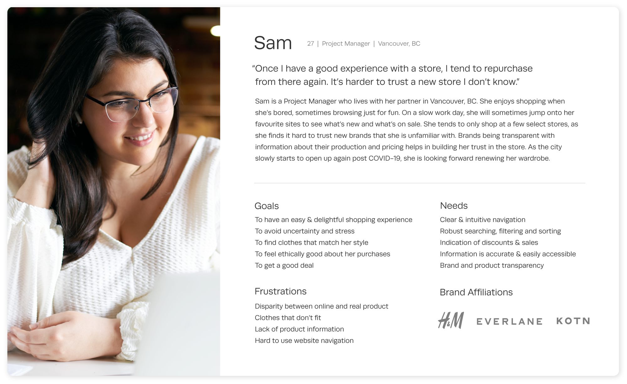
Based on my user research, I created a persona (meet Sam!) that consolidated the behavioural & attitudinal patterns that I discovered into one profile. This helped me to humanize my research findings and guide my decisions as I moved along in my design process.
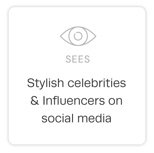
To build empathy with my persona, I then created an empathy map that explored what Sam thinks, feels, sees, hears, says, and does.
View my full empathy map.
Task Flows
I identified 3 essential task flows that my user needs to complete to meet the goals of my project, and consequently informed the key screens that need to be designed.
User Flow
Based on my task flows, I created a user flow. The user flow builds onto the task flow, with a scenario and multiple decision points that illustrate several ways my persona, Sam, could complete their task. This helps me understand the choices that users will have to make when navigating the website.
Scenario
Sam has a birthday event to go to, and she want to purchase a new dress. She has heard her friends rave about Muse before, and wants to see if they have what she wants.
Wireframes
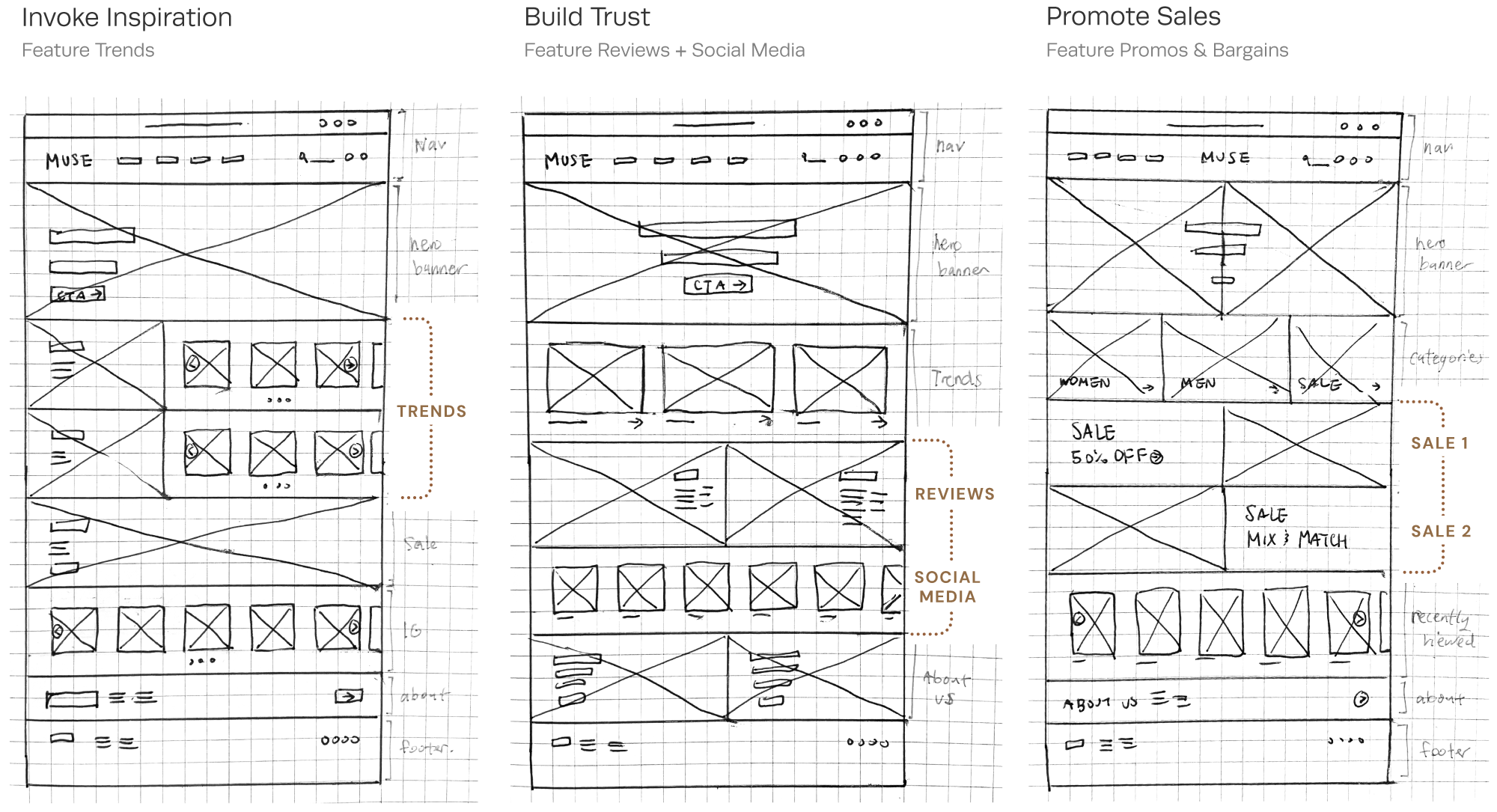
I started my wireframing process with some quick sketches of the homepage, exploring 3 distinct goals - invoke inspiration, build trust, and promote sales.
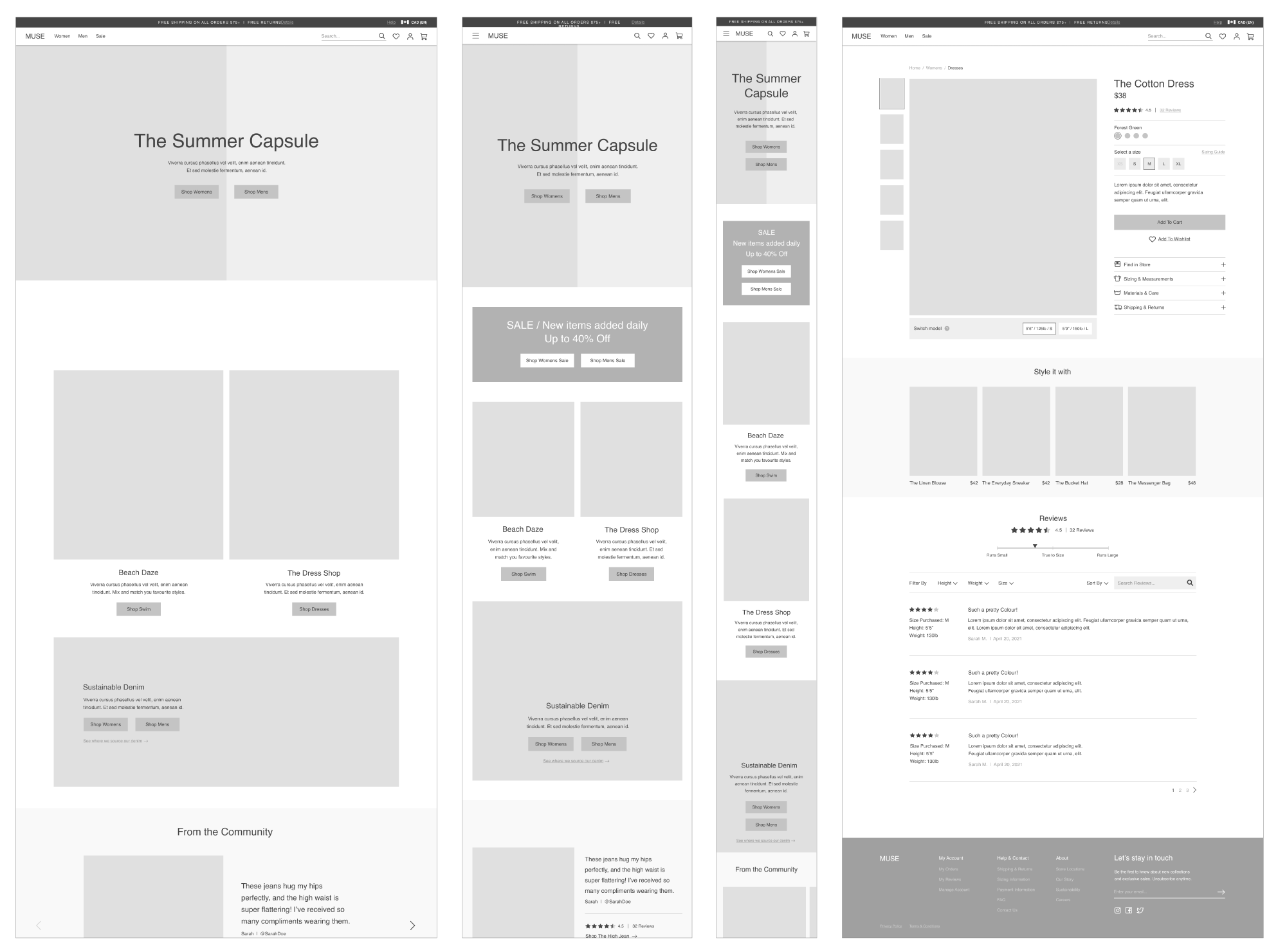
Using my sketches as a jumping off point and combining features from each sketch, I moved onto Figma to develop my mid-fidelity wireframes. I created all the the pages within my task flows, as well as responsive designs of the homepage for both tablet and mobile screens.
I prototyped the wireframes and did an informal test with 3 participants to make sure I received a 100% completion rate before moving forward.
Branding + Style Tile
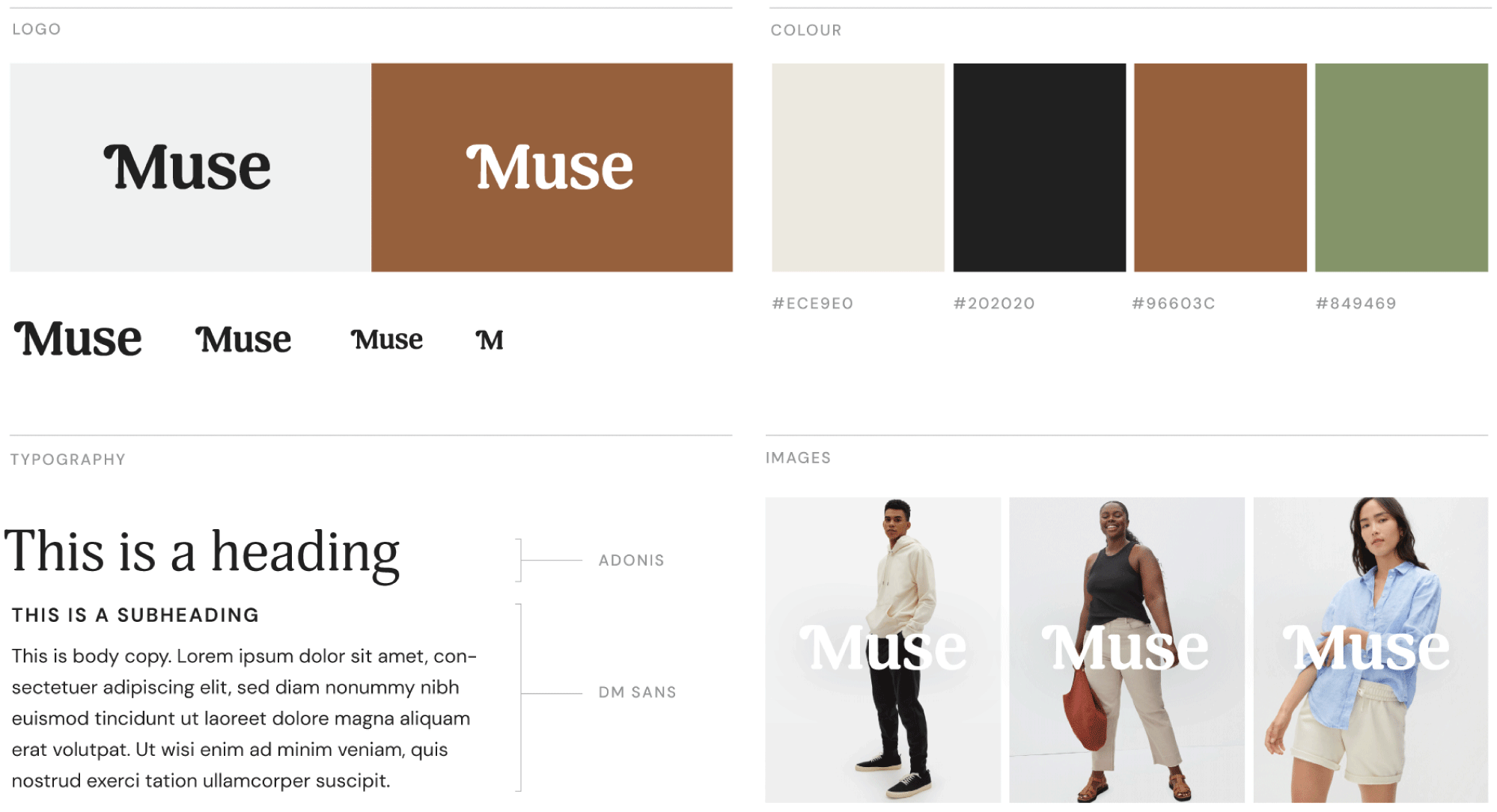
Looking back at the project brief and research insights, I came up with 3 brand attributes and 3 brand values to guide my visual exploration. Keeping these brand attributes and values in mind, I developed the branding + identity and organized key elements into a style tile that served as a visual guide moving forward.
Brand Attributes
Minimal but not mundane
Friendly but not silly
Reliable but not rigid
Brand Values
Sustainability & Ethics
Sizing Inclusivity
Quality > Quantity
High-Fidelity Prototypes
With my style tile in hand, I went back to Figma and began the process of applying the brand elements across my mid-fi wireframes. I then built out an interactive prototype to prepare for usability testing.
Usability Testing
I conducted remote moderated usability tests on 5 participants, giving them a scenario and a task to purchase an item. while thinking aloud. My test objectives were to:
Find out if users can complete the task, beginning to end
Find out where users may be confused or frustrated during the task
Find out how long it takes for users to complete the task
Observe user reactions & behaviour while interacting with the prototype
Implementation
In order to prioritize the design changes discovered from my usability testing, I created an effort/impact matrix. In the limited timeframe of the project, I focused only on these 2 quadrants: Quick Wins and Fill Ins.
I chose to highlight 3 key design changes below, explaining the intention behind the change and the before & after of the design.
Switch Model Feature
Users either missed the switch model feature completely, or only noticed it at the end, right before adding the item to the cart.
Free Shipping Progress Bar
Users saw the free shipping progress bar, and expressed frustration that they were so far away from free shipping. Understanding the endowed progress effect helped inform my design solution.
Default Sizing Guide
Users were confused that the garment measurements were shown as default, and noted that they usually expected to see body measurements shown first.
Muse - Key Features
Community Testimonials
Real, honest peer reviews establish credibility and help customers build trust with the brand.
Switch Model Feature
The Switch Model feature allows customers see the product on different body types, helping them make a more informed decision when purchasing.
Add to Cart
Customers can select the colour, size, and add the item to their cart.
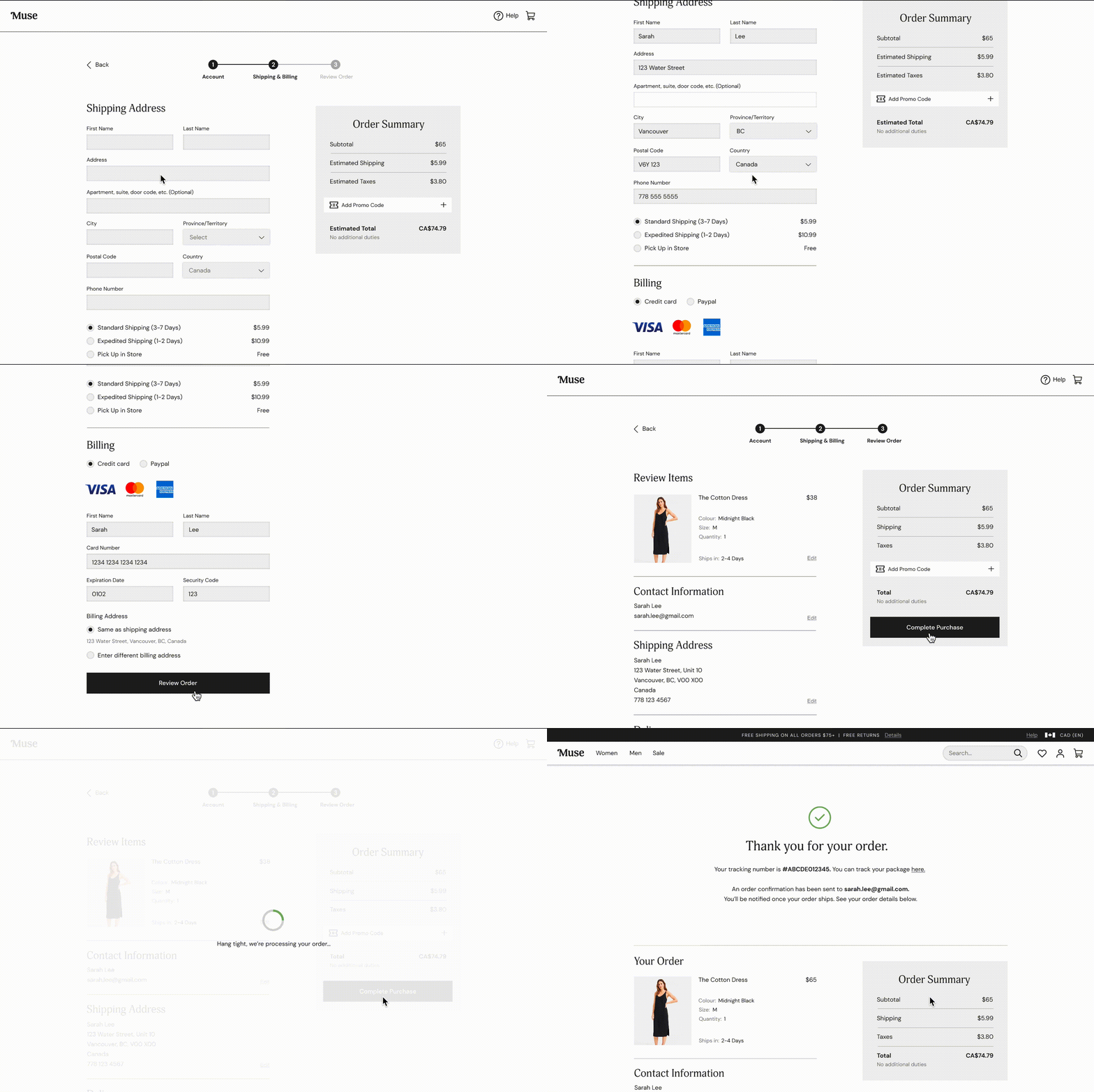
Checkout
An easy, distraction-free checkout process.
Reflections + Next Steps
This project involved many layers of research, and while arduous, the methodologies all helped to strengthen and support the final outcome. Through the process I have learned a lot about eCommerce web design, and people’s behaviours and attitudes surrounding it. I found that as eCommerce is such a saturated field, looking at successful competitors and existing design patterns largely helped to guide me in making design decisions.
Due to the limited timeframe of this project, I could only focus on a handful of screens that related to my main task flow. If given more time, I would have loved to explore the concept of inclusive sizing further - especially the Model Switch feature - as it seemed like an innovative feature that many of my participants were excited by. I would also do several more rounds of iterations and testing to validate the implementations I made to my design.


