Nucli
An eLearning SaaS Website
Nucli is a full-service eLearning solution that help companies manage workflows and operating procedures with online training. They are one part software platform and one part collaborative content creation service.
They work with with clients to develop a custom learning plan, and provides creative production services to create rich multimedia course content. The digital platform — Nucli App — consolidates all materials and communications within one modular, flexible, and customizable platform.
Role
UX Designer
Softwares
Figma
Adobe CC
Date
Aug - Oct 2021
Timeframe
10 Weeks, 80 Hours
Nucli’s existing website was in obvious need of an update. After discussions with the client, the goal became clear:
How can Nucli’s new website effectively showcase the product to increase lead generation and conversion rates?
Research Plan
I began by creating a research plan that outlined the problem space, research goal, research questions, methodologies, participant screening requirements, and assumptions.
View my full research plan.
Competitor Analysis
I conducted market research to familiarize myself with trends and best practices in marketing software products. I then created an in-depth competitor analysis to identify common design patterns and features in similar eLearning websites.
View my full in-depth competitor analysis.
User Interview + Testing
I interviewed 5 working professionals in a range of different industries, working at large (1000+ employees) companies and organizations. I screened for participants that had that had experience with one or more of the following:
• Being a user of eLearning softwares
• Being involved with the purchasing of softwares in general
• Managing & creating content for eLearning softwares
5 Participants
Existing Nucli Website
Key Findings
In order to make sense of the raw data, I organized my notes into an affinity map - organized first by participant, then organized based on common patterns. Seeing the reoccurring patterns in the affinity map guided me in writing up the research report, which details in-depth all the key insights found through the interviews and testing. This report also helped my client see and understand the results of the research, which will ultimately guide me when designing the website.
View my full affinity maps and my full research report.
Users need to quickly understand what the product does and how it solves their problems when landing on a site.
Most users typically don’t read, but rather skim the pages very quickly. All users were confused about what Nucli actually does, and had to read many pages of content to understand.
Users wanted to see their company or industry being represented in the website.
Users wanted to see what industries the software is serving, so they can quickly gauge if the software is right for them.
Peer reviews and recommendations are very valuable.
Many users are in online communities related to their profession, and will ask for software recommendations in these groups. Having a real person give a positive review of a software helps add credibility to the software.
Product pricing is an important factor.
Software procurement processes usually involve the Financial Department to oversee budget. Users noted frustration with companies that are coy with their pricing.
Users wanted to see a video demo/tutorial of the product.
Users noted that a short video is a good way to learn about the product quickly. One user also noted that it’s easier to send colleagues videos rather than websites.
Booking a Demo feels like a big step for users.
Users wanted to know what they are getting in the demo. Since booking a demo is a big step, one user also wondered if there’s another option for them to ask questions before moving onto the demo step.
Key features that users value in eLearning softwares include; customizable branding, accessibility, showing user progress, data security, micro-modularity, and content creation services.
Some other features include: translation of course languages, accommodating for different levels of tech literacy, and having a mobile version of the platform.
For most companies, switching softwares is not high-priority as it is a very complex, time-consuming, and resource heavy process.
Users noted that there has to be strong consensus that the current software is not working, and proof that another platform would work significantly better.
There are usually a lot of different people from different departments involved in the software procurement process.
These people can include; project managers, subject matter experts (the actual users), people from IT, people from financials, and directors and executives for approvals. There are usually a lot of demands from different groups of people on what the software should be like.
Personas
I created personas that consolidated the behavioural & attitudinal patterns that I discovered from my user interviews and testing into 2 distinct profiles. This helped me to humanize my research findings, build empathy with users, and guide my decisions as I moved along in my design process.
My primary persona is Kate, a project manager at a biotech company, and my secondary persona is Joe, a business executive at a food manufacturing company.
Customer Journey Map
I discovered from my research that the customer journey goes beyond the user’s interactions with the website. With my primary persona Kate in mind, I created a customer journey map that shows the entire process, from discovery to advocacy.
Seeing the bigger picture helped me understand how the website fits into the entire customer experience, and be able to identify other areas of opportunity. It became clear that the key area of opportunity is within the Research Stage - This is the moment when customers would first learn about the product, and decide whether or not to move forward.
How Might We
After reviewing all my research insights, while keeping my original goal in mind, I reframed user pain points into “How Might We” (HMW) statements. This exercise allowed me to convert problems into open-ended opportunities for design.
I then started brainstorming solutions for each “How Might We” statement, noting certain scope/technical limitations in red.
My “How Might We” statements were all centred around my original goal:
How can Nucli’s new website effectively showcase the product to increase lead generation and conversion rates?
Project Goals
Before narrowing down and prioritizing solutions for the new website, I needed to take a step back and look at the goals of both the business and the user, as well as technical considerations. Keeping these in mind will ensure the features I include will be technically feasible and strategically serve all parties involved.
Site Map
Taking the solutions from the “how might we” exercise, I began creating a site map to lay out the basic structure of the website. After discussions with the clients and looking at what would realistically be feasible in this iteration, this was the final site map that we landed on.
Wireframes
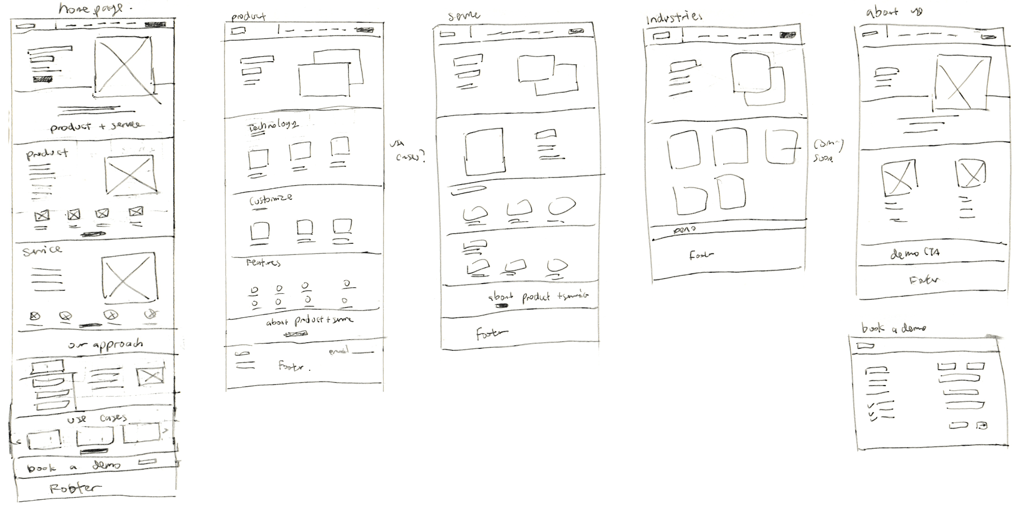
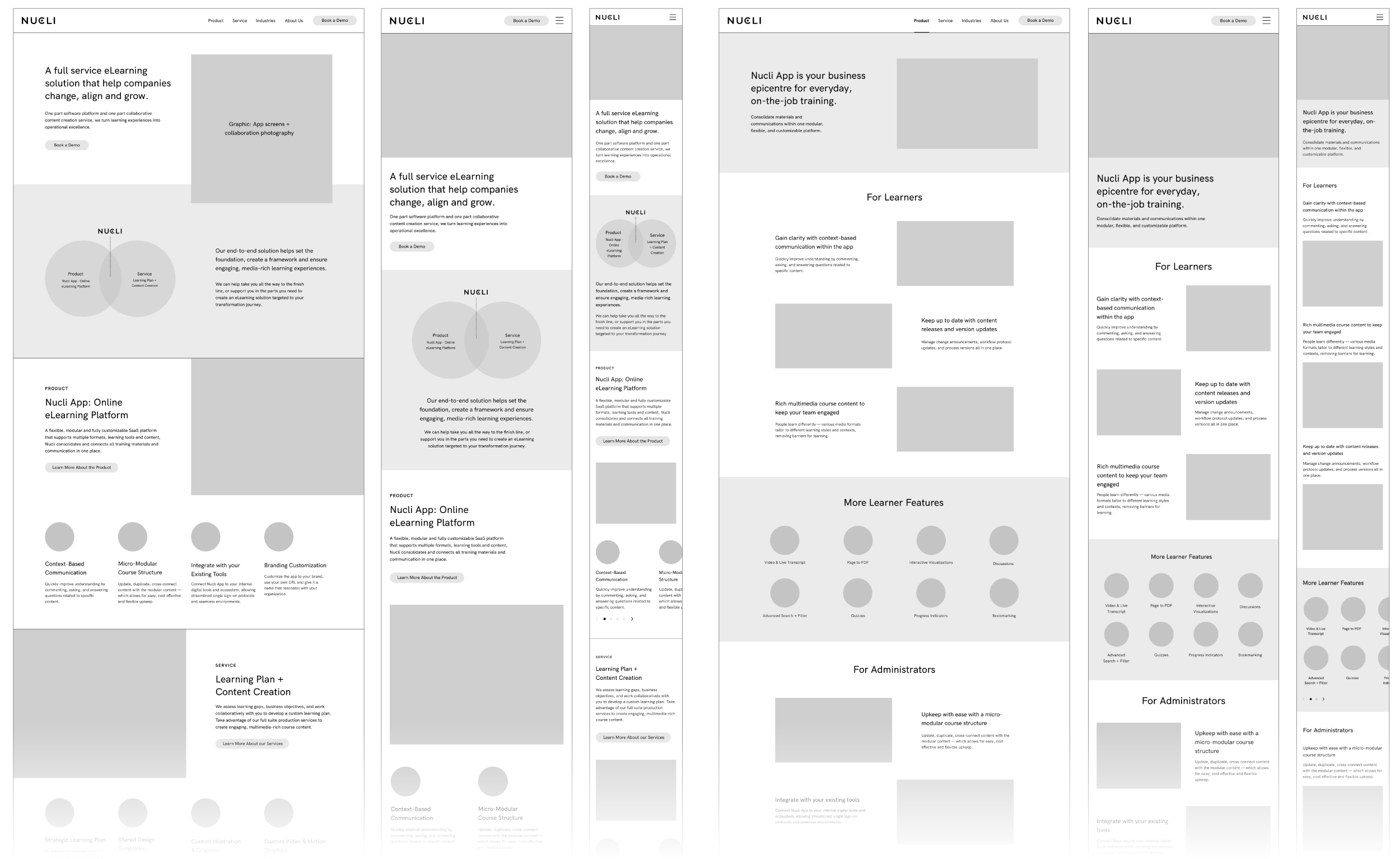
Using the Site Map as a guide, I started sketching rough paper wireframes, then jumped into Figma to develop my mid-fidelity wireframes. I created all the the pages within my site map, as well as responsive designs of the homepage and the product page for both tablet and mobile screens. Since information clarity was a major issue from my research, I spent some editing the content to allow for skimmibility.
The clients also provided feedback and suggestions which were discussed and implemented.
High-Fidelity Prototypes
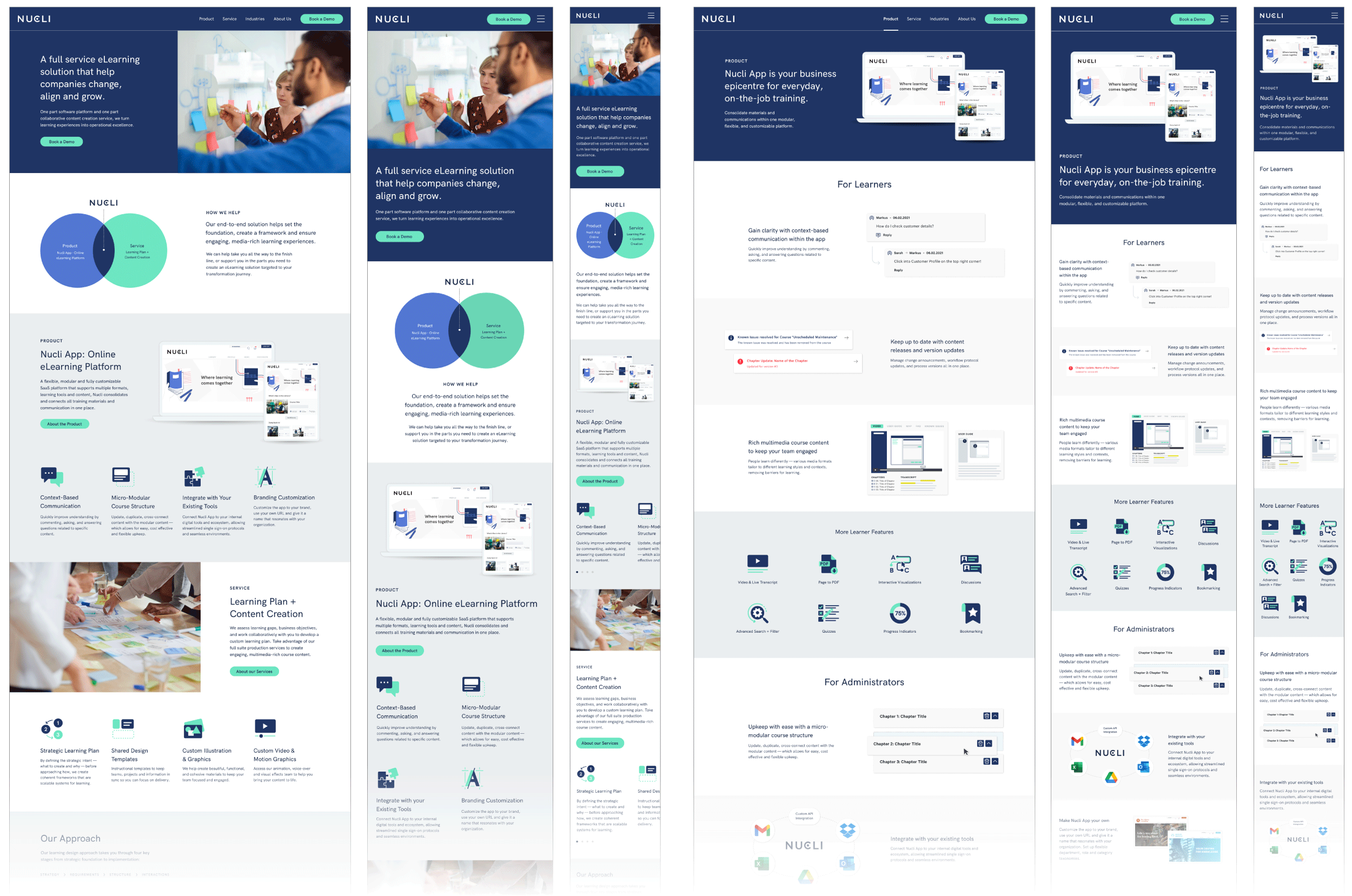
I went back to Figma and began applying Nucli’s brand elements across my mid-fi wireframes. I also reviewed Nucli App features in detail, before creating all the custom iconography and graphics that accompanied the copy.
I then built out an interactive prototype to prepare for usability testing.
Custom Iconography
Custom Graphics
User Testing + Findings
I conducted remote moderated user tests on 5 participants, asking them to explore the website while thinking aloud. Two participants were from the original 5 that I had interviewed, and 3 were new participants, from all different backgrounds and professions.
I followed up with additional questions after the user test was finished:
What is your overall impression of the site?
How do you feel about the content on the site?
How do you feel about the images and graphics on the site?
Please take a look at the menu navigation at the top. Were these categories helpful when you were navigating through the site? Did each page provide the information you expected when you clicked into them?
Prioritization
In order to prioritize the design changes discovered from my usability testing, I created an feasibility matrix. In the limited timeframe of the project, I focused only on these 2 quadrants: Quick Wins and Fill Ins.
I chose to highlight 3 key design changes below, explaining the intention behind the change and the before & after of the design.
Add clarity to the phrase “Nucli App”
Users were confused about the use of the word “App” - Many thought it meant a mobile application on their phone.
Add in pricing call-to-action in footer
Users were frustrated when they could not find any pricing information, or mention of pricing anywhere on the website.
Adding more detail and context to graphics
Users thought graphics were too generic and did not reflect “Rich multimedia course content”. Other graphics were missing key pieces of context.
Nucli Website - Key Features
Skimmable Content
Skimmable and informational headings, accompanied with relevant graphics.
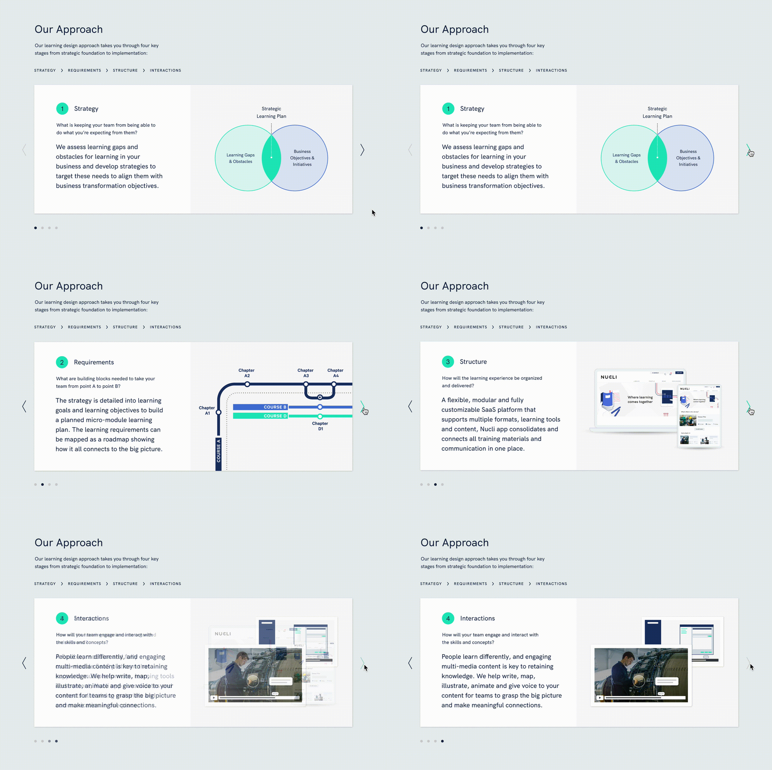
Learn About Our Approach
Carousal that goes through the 4 steps of the Nucli process — Strategy, Requirements, Structure, and Interactions.
Explore Industries
Explore the different industries that Nucli can serve, from restaurants to aviation to education.
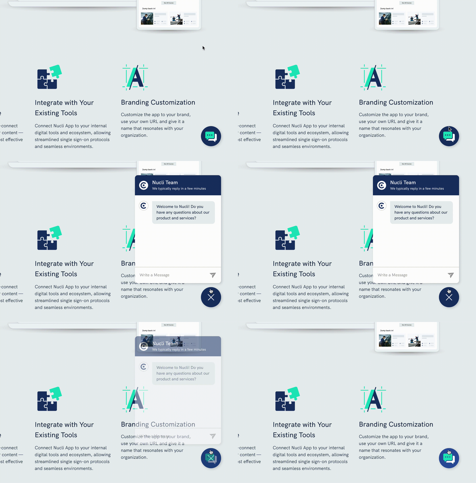
Chat with a Live Agent
Chat with a knowledgeable sales agent who can answer questions and generate leads.
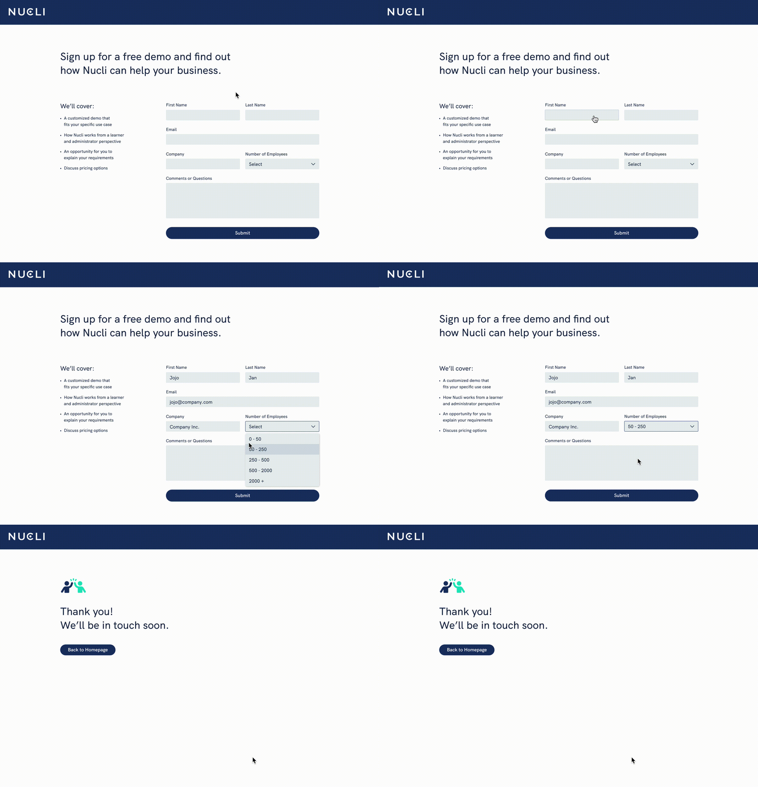
Book a Demo
Sign up for a free customized demo that fits each customer’s specific use case.
Reflections
I learned so much about marketing software for enterprise in this project, things like best practices, the customer journey, the people involved, and how it differs slightly from industry to industry. One of the biggest takeaways was that people are wildly impatient — they consume information on websites by skimming. If they don’t get a satisfactory answer within the first few seconds of scrolling, they will be frustrated. The question for me was: how do I present information that is deeply complex in a way that people can understand through skimming?
One problem I encountered was that the users I interviewed weren’t quite the preferred target audience (users who had experience procuring eLearning software), so I had to pivot and ask about other softwares instead of only eLearning softwares. While all software procurement follow a similar customer journey, there may have been nuances specific to eLearning softwares that I missed.
I also learned that the customer journey goes far beyond the website — the website only plays a small part of the entire process, and to truly empathize with the customer, you have to look at their entire journey.
And lastly, in an ideal situation there would be more time and resources for me to animate the graphics and create a short demo video, as my research showed that this would engage users and help them understand the product faster.
